Understanding the Temperature Timeline and Timestamps
Last updated: December 13, 2025
Watch the video explanation above ⬆
The temperature timeline gives you a complete, time-based view of temperature conditions across the entire shipment.
On the left-hand side of the chart, you’ll see the temperature scale. Along the bottom of the chart, you’ll see the full timeline with date and time stamps spanning the shipment from start to finish. Together, these axes let you understand not just what happened, but exactly when it happened.
You can move your mouse cursor across the chart to follow the shipment point by point. As you hover, the chart updates in real time, allowing you to pinpoint the exact moment a temperature change, excursion, or deviation occurred.
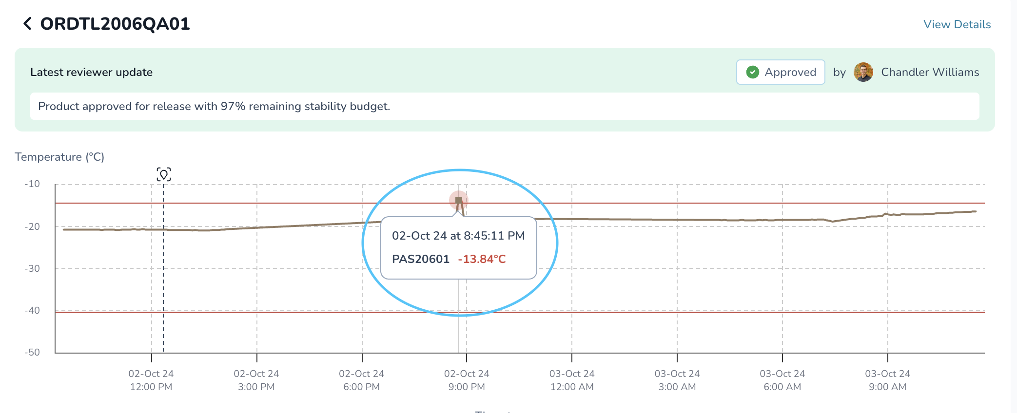
This level of visibility is especially valuable during reviews and investigations. Instead of guessing when an issue happened, you can clearly see how long the shipment was out of range, where it occurred in the journey, and how it aligns with other shipment events like handoffs or delays.
The temperature timeline helps teams quickly assess impact, support confident release decisions, and provide clear documentation for quality, compliance, and audits.